
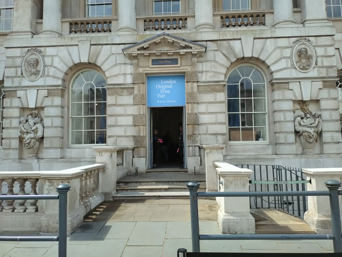
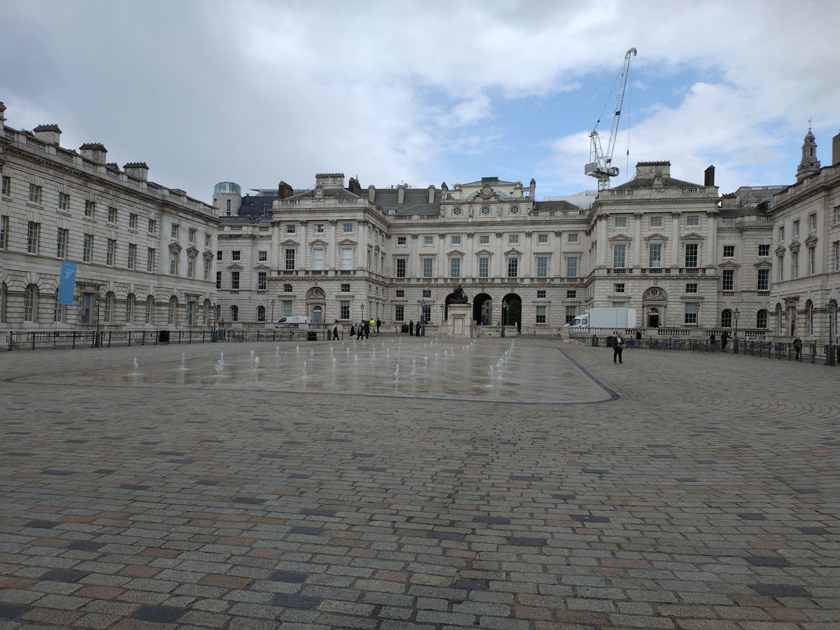
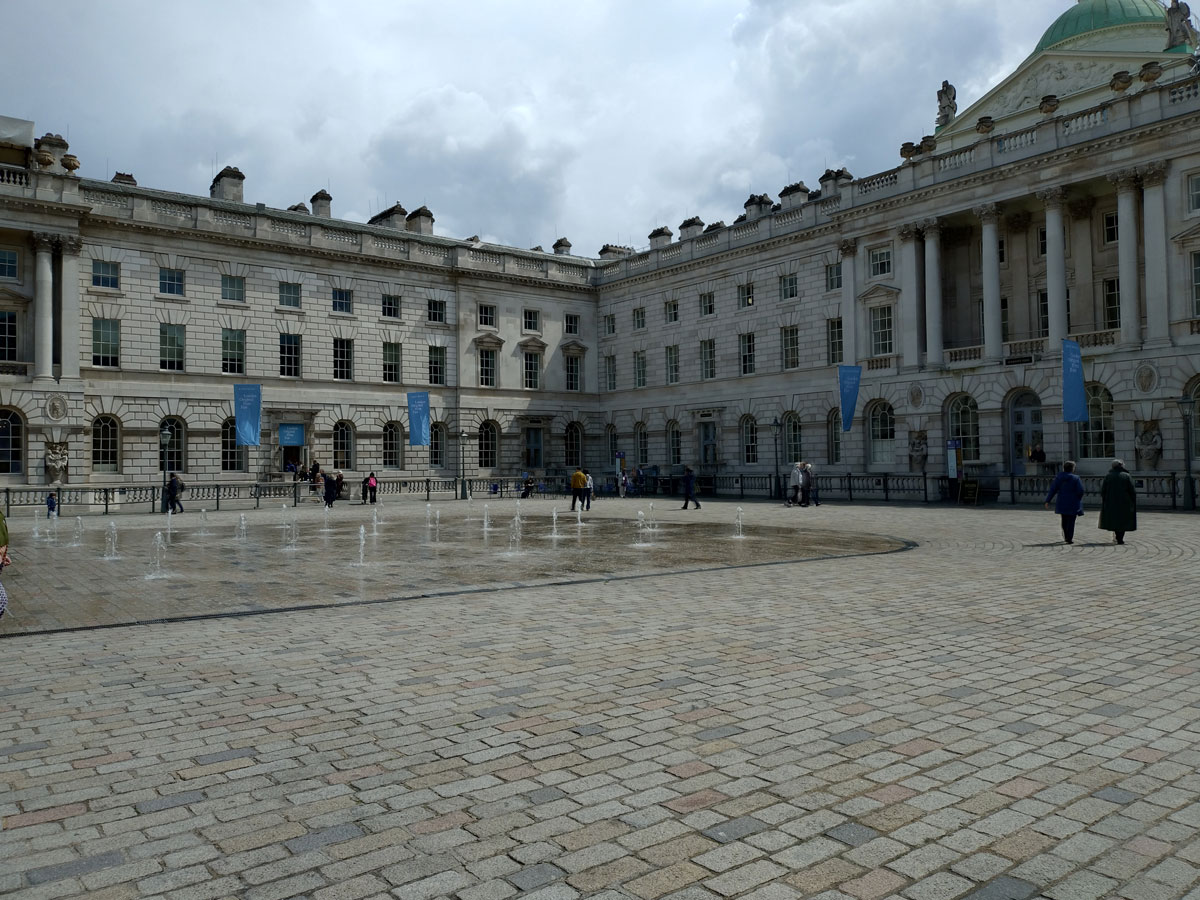
We did go check out the London Original Print Fair at Somerset House on the opening day, well we happened to be passing, walking along Fleet Street after an encounter with the Lady Mayor and her guards down at Cannon Street station, the main reason for being in the area, a visit to the just opened Jason Shulman exhibition Moving Pictures at the new Ashley Saville Gallery on the aforementioned Fleet Street, more on that in a moment, always good to see a new gallery opening in such a positive way and the variety of the architecture of Fleet Street is always worth a moment. I’m no fan of art fairs, they tend to feel like cattle markets, and print fairs can be particularly soulless, something about all that glass and the polite frames that almost tames the art…
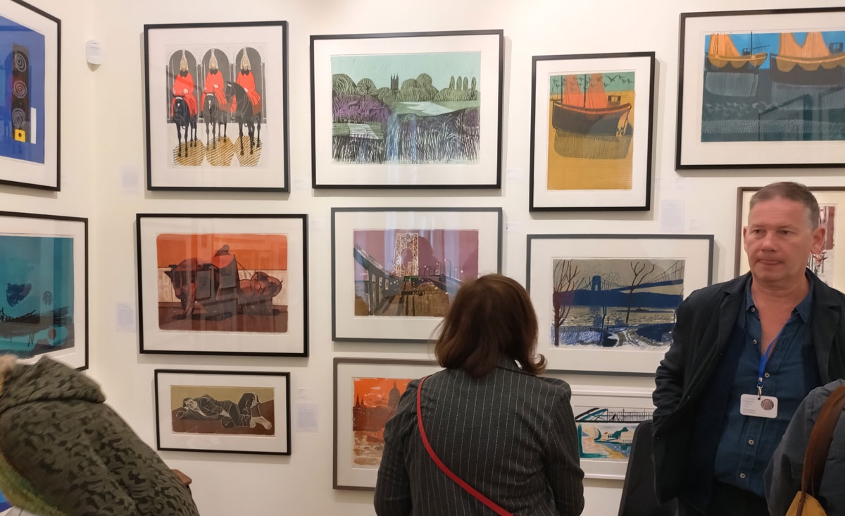
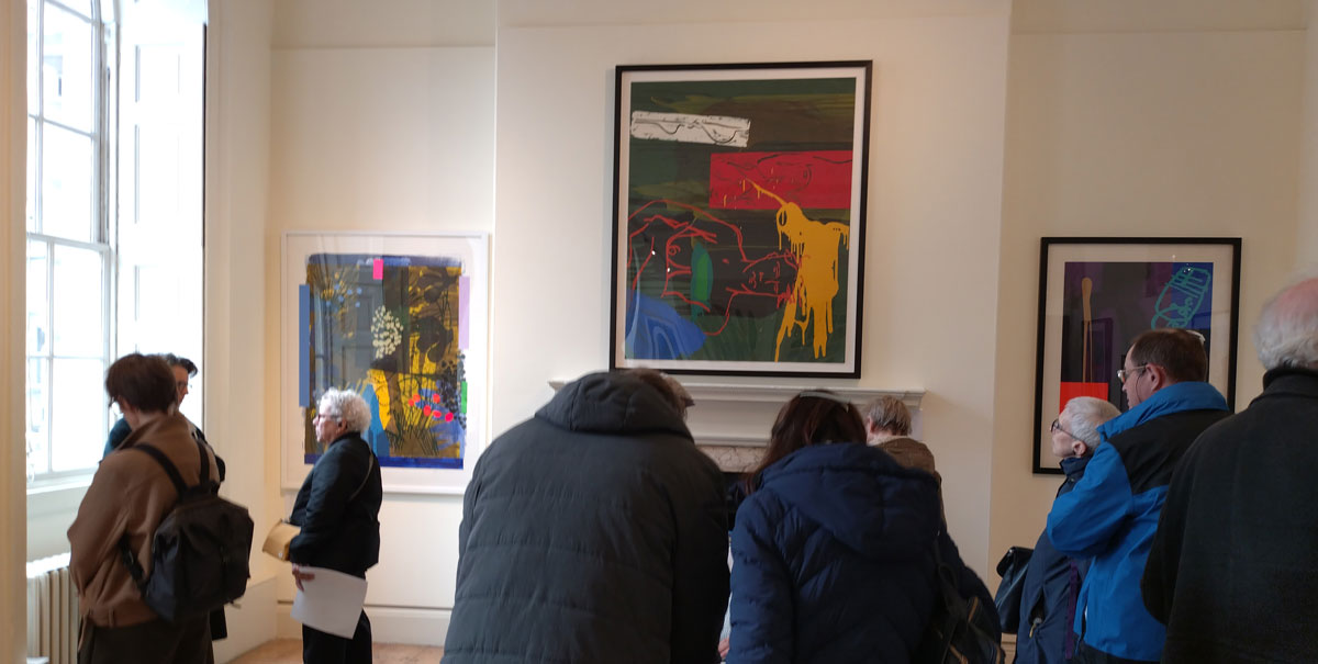
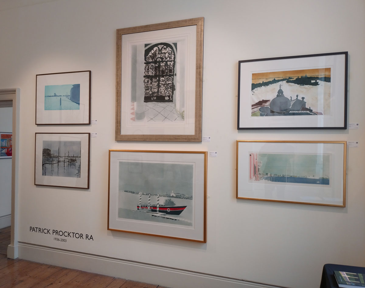
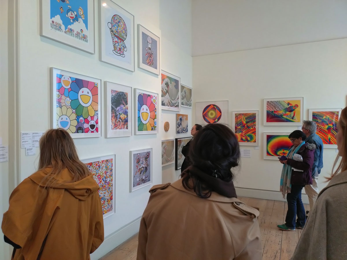
London’s longest-running art fair so they say, the London Original Print Fair, once again held at Somerset House, presents us with room after room (after room) of mostly over-crowded salon hangs, well it is all about selling and I guess needs must, pile it high and get it sold.
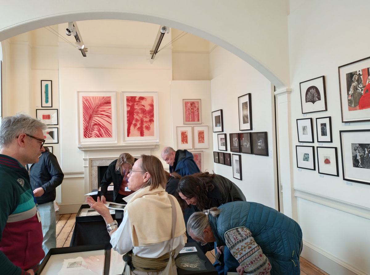
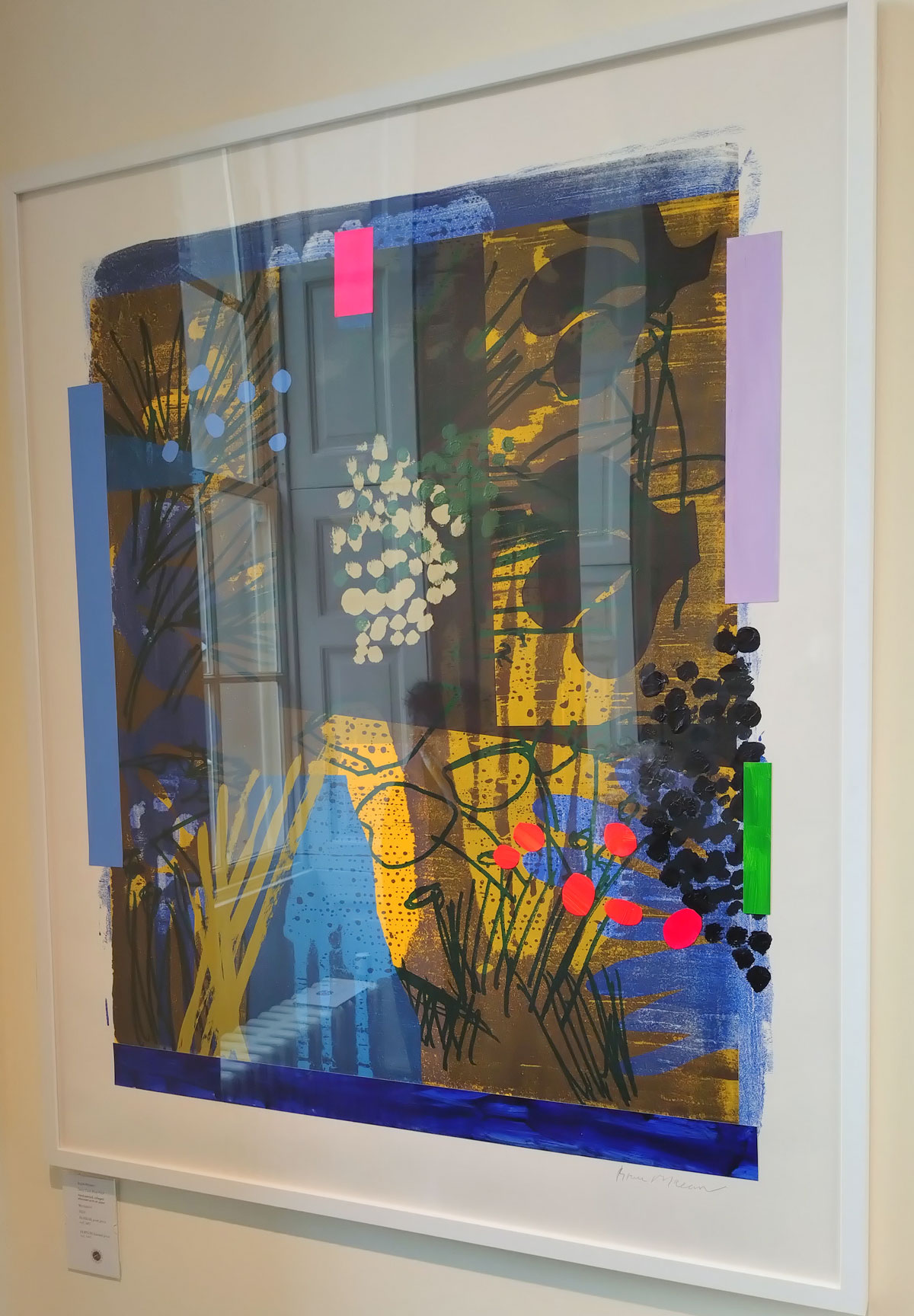
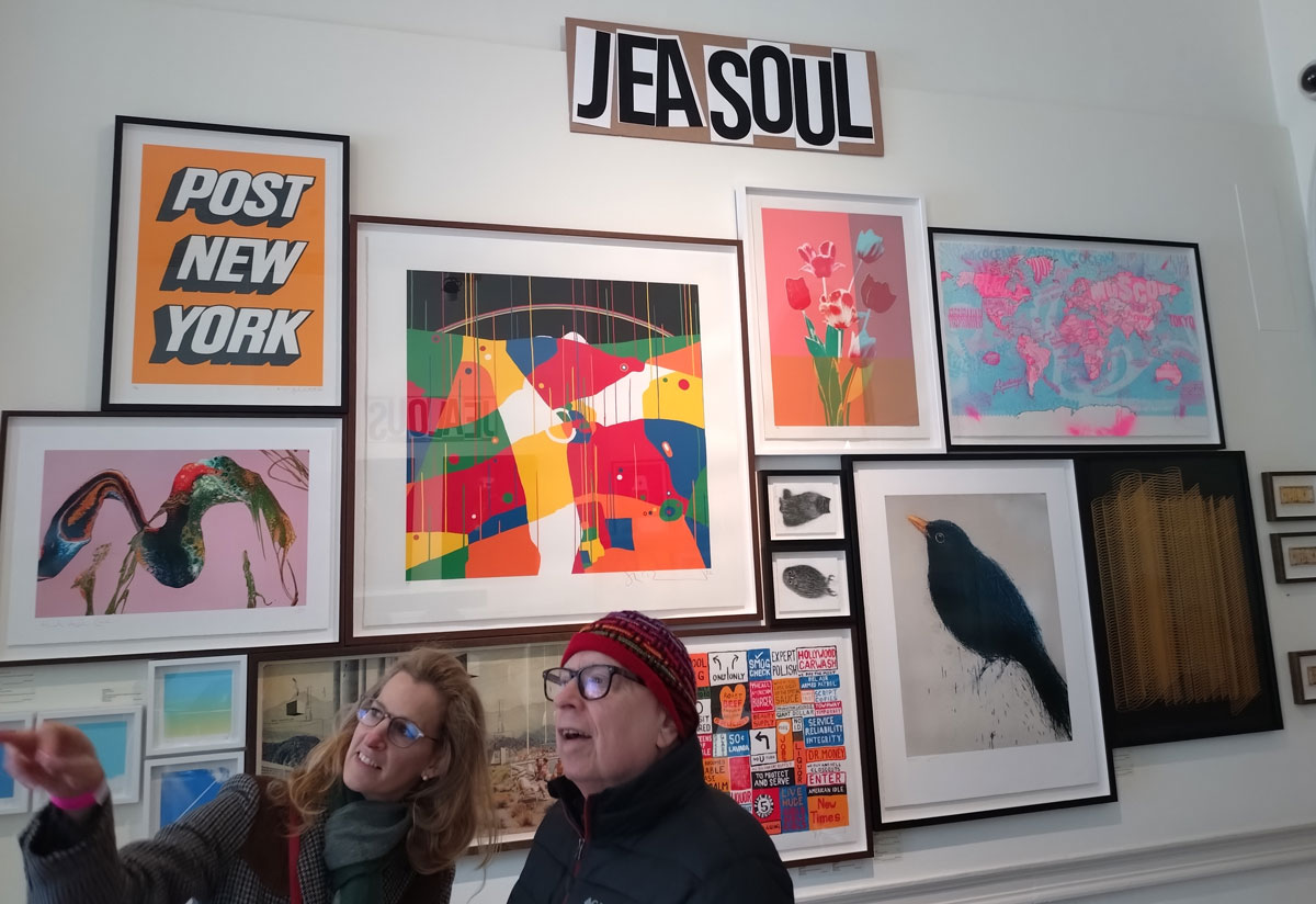
What shall we call most of what we see? Old school? Traditional? Polite? It isn’t exactly cutting edge, but then you don’t really expect it to be, it is most the more traditional collective and galleries, almost very nearly a touch of almost attitude from Shoreditch’s Jealous Gallery but really, fluorescent pink and yellow screen prints of bananas Jealous?! Hey look, fairs like this always try to cover far too many bases and it would be very easy to go take cheap shots at it all and really, besides those pink and yellow bananas (at least there were no soup cans this time), as conservative as it all was, it didn’t really deserve too many cheap shots. A couple of hours spent wondering around the rabbit warren that is the rooms and room of prints in Somerset House and of course there’s some nice work and yes, really we want more than just ‘nice’.
Here, in no particular order, is the pick of what we saw, the highlights of what was mostly, if trutvh be told, an underwhelming mostly rather conservative art fair…
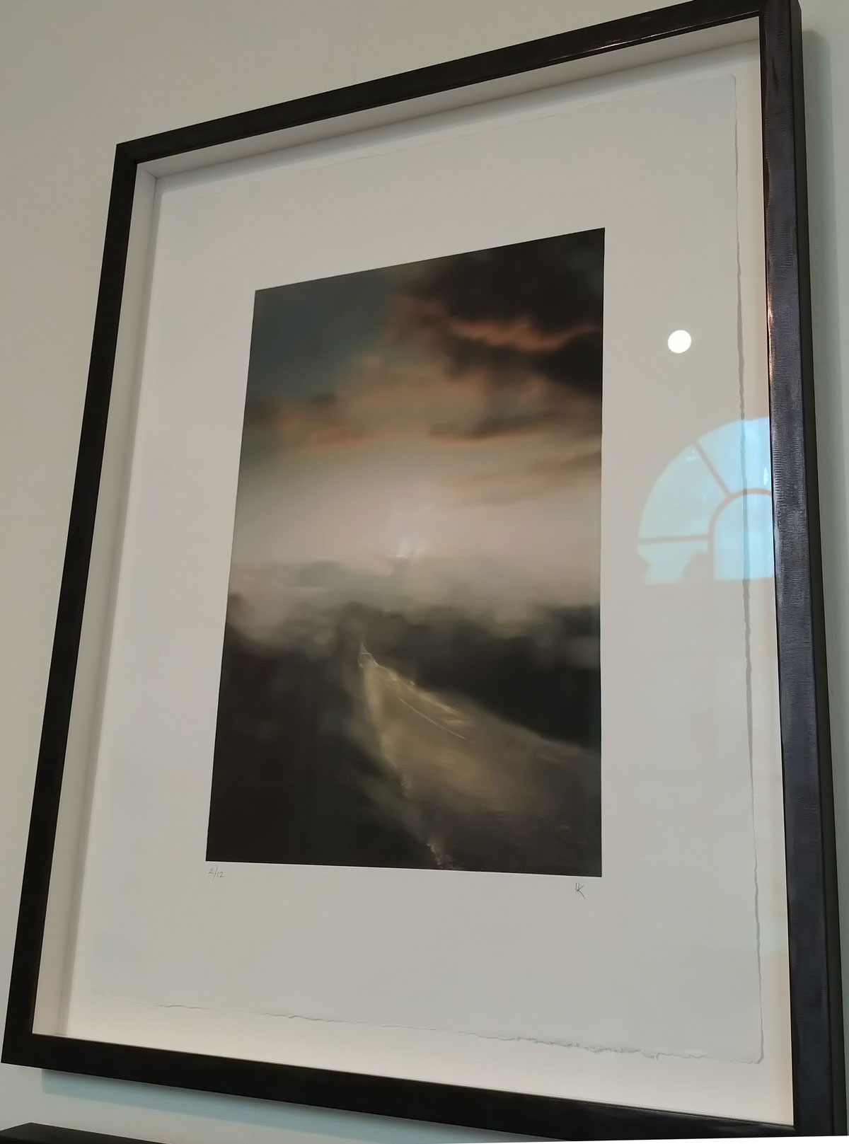
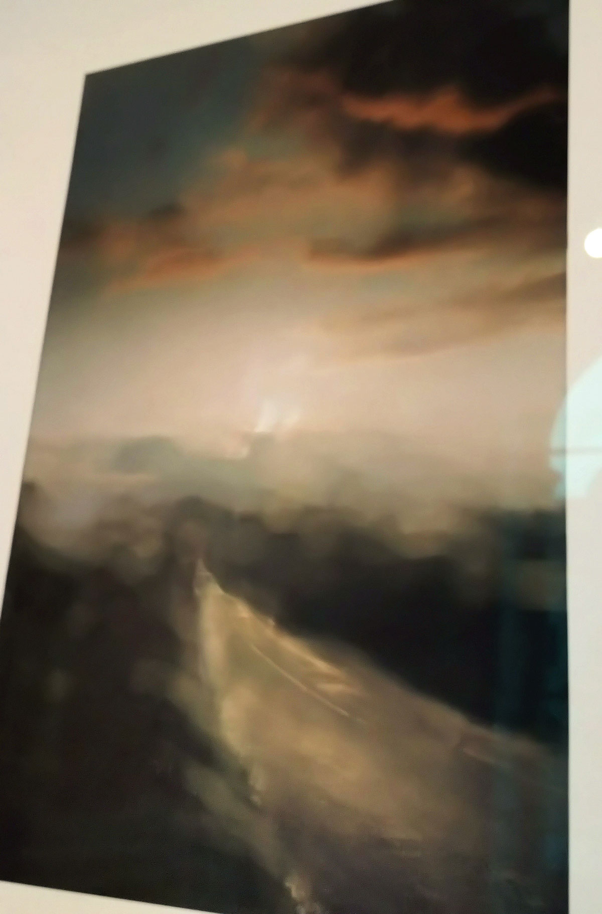
1: Henrik Knudsen, and a something called Until it Isn’t, a rather gorgeous looking piece that we’re told by the label involves Polymer photogravure with chine collé which in turn is something to do with combining water-etched photopolymer plates (which create rich, continuous-tone photographic intaglio prints) with chine collé – a technique that bonds delicate, lightweight Asian papers (such as Koso or mulberry paper) to a heavier backing paper during the press run (or so a quick online search and A.I. tells us, don’t ask me, i just throw paint at canvas and anyway, A.I is wrong more times than right so who knows, all I can tell you in that the limited edition print stood out. The piece is being shown by Artichoke. Henrik is a Danish born London based artist, a photographer, according to his website; “Henrik’s emotive use of light is inspired by his interest in film and cinema. He likes mixing natural and artificial light sources, always with the aim of telling stories of people and their environment” and well, his piece seemed alive with emotion and maybe just a hint of J.M.W Turner about the quality of it…
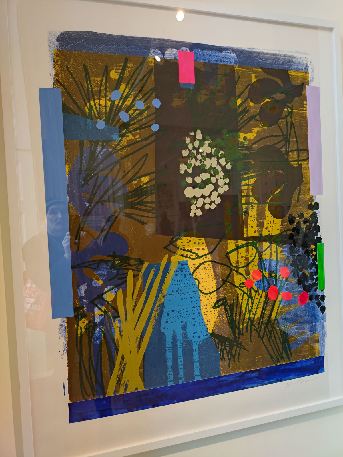
2: Bruce McLean‘s Deep Dark Blue Pool, a hand painted, collaged, silkscreen print on paper, a large monoprint dated 2024 is a beautifully coloured, deliciously detailed stand out piece that CCA galleries are showing…

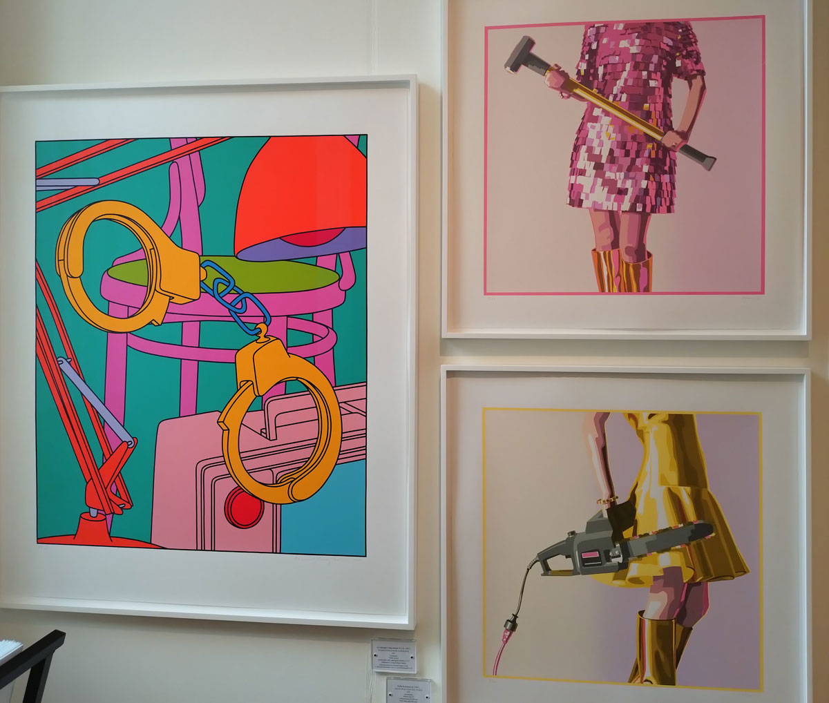
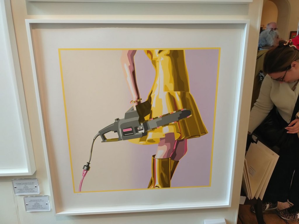
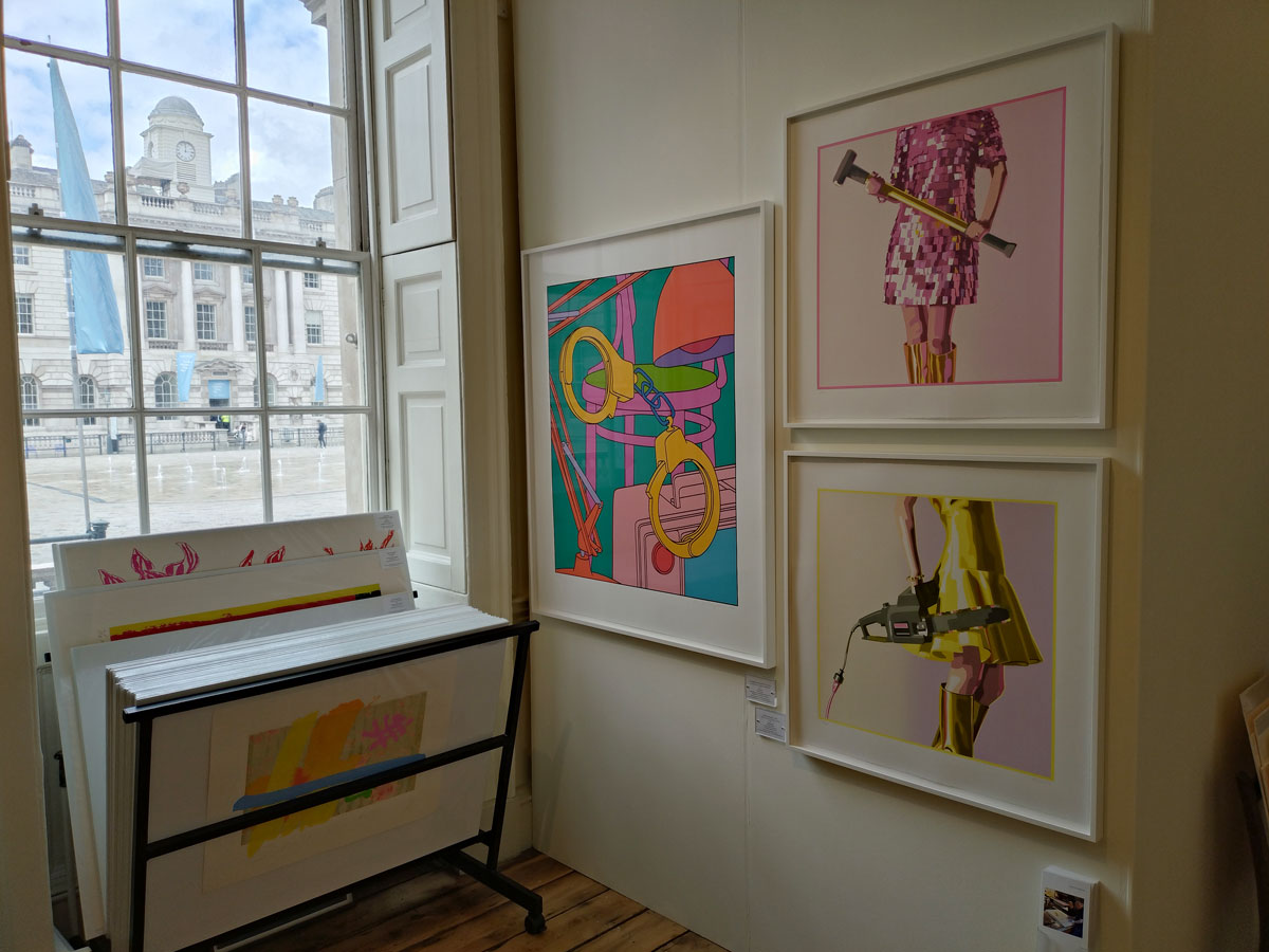
2 and a bit, the Kelly Reemtsen screenprints have a bit of much needed attitude, a touch of challenge, her chainsaw and the girl with the mallet, Love You To Bits and Crack On really do stand out for more than one reason –
“Widely recognised and avidly collected, Kelly Reemtsen is known for her iconic series of richly textured paintings featuring stylish contemporary women wielding the kind of powerful tools traditionally reserved for men. This recurring image acts as a metaphor for the capable women who arm themselves with quick minds, inherent talents, and the necessary resources to achieve success in today’s complicated world. Reemtsen addresses her subject matter with style and wit but her intentions are serous. What will it take for today’s women to achieve equality?” Here’s her Instabloodygram
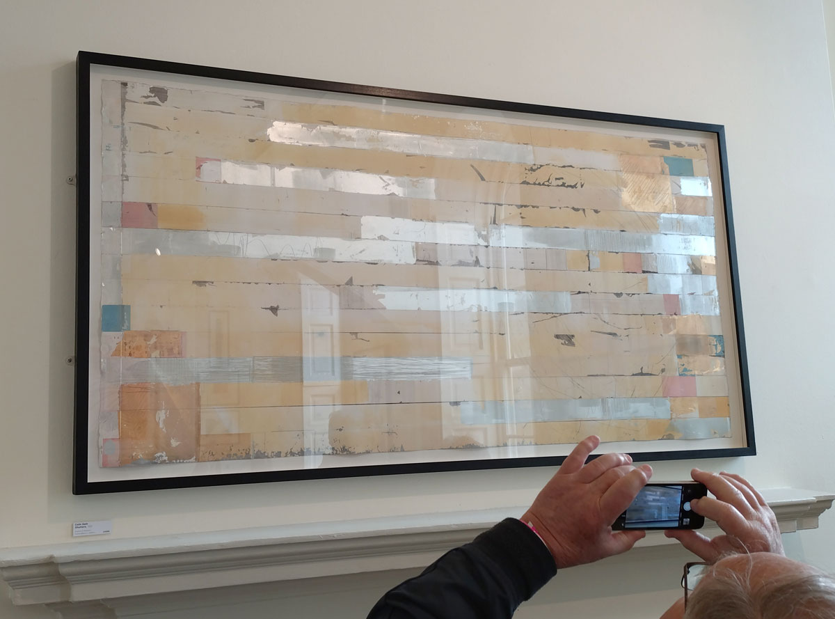
3: There was a Colin Gale piece called Shutters that dates from 2020, a big drypoint and monoprint piece that rather stood out as something a little more challenging than most of what we saw, it is impossible to photograph in any kind of decent way high up on the wall with all the reflections. Alas Colin Gale (RA) doesn’t appear to have a website or indeed any kind of social media presence that I can find (is than an alas or is it rather refreshing).
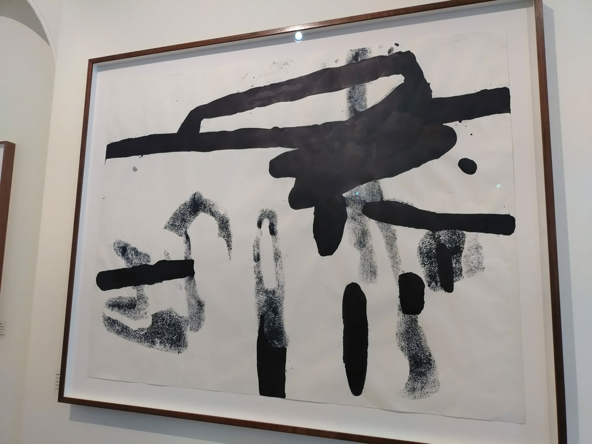
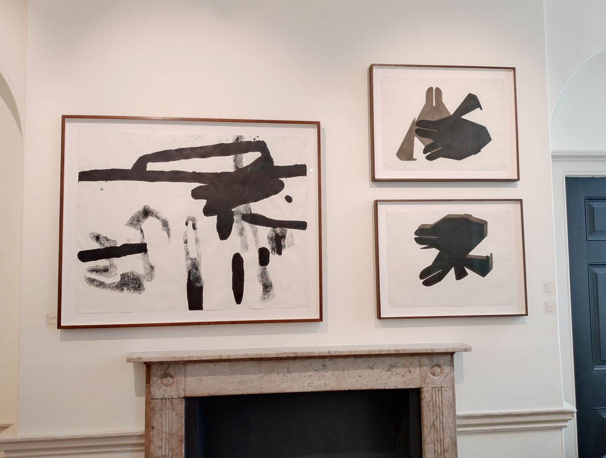
4: There’s a rather boldly black and white Dori piece, well there’s two or three but the larger piece, a drawing/monoprint was the piece that called me over, that’s the one that stood out…
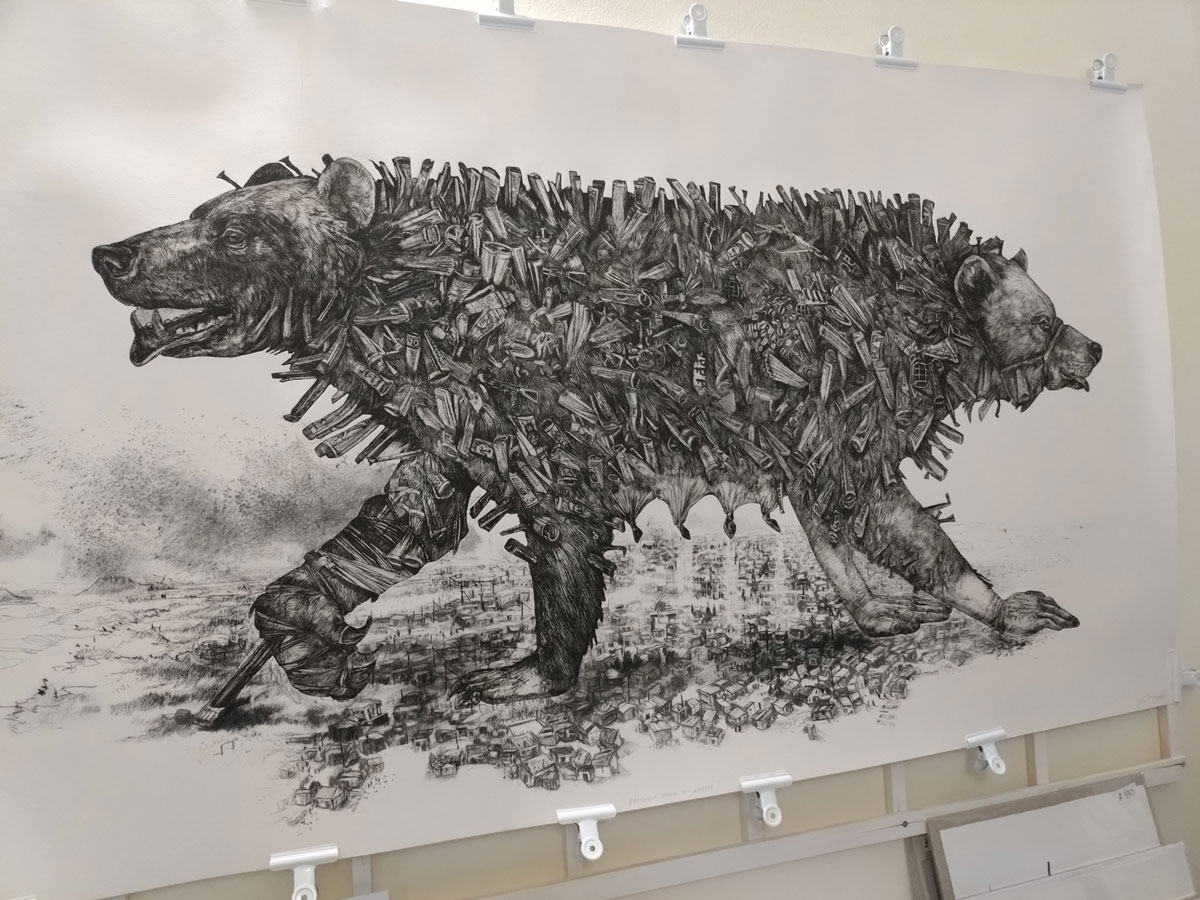
5: Diane Victor‘s Bother Bear was a pleasure, an etching, an aquatint or, well don’t ask me, I only ever spent one day anywhere near an etching studio, it burnt my eyes, it told me to stay away, this big bear was far more inviting although I do suspect a little morte time spent with it would have revealed some of the artist’s complex comment a little more, so much going on there both in terms of the art and the statement. The piece was being shown by French Gallery Atelier Le Grand Village.
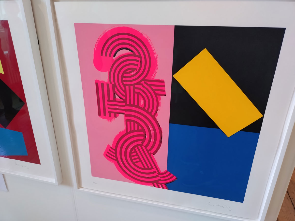
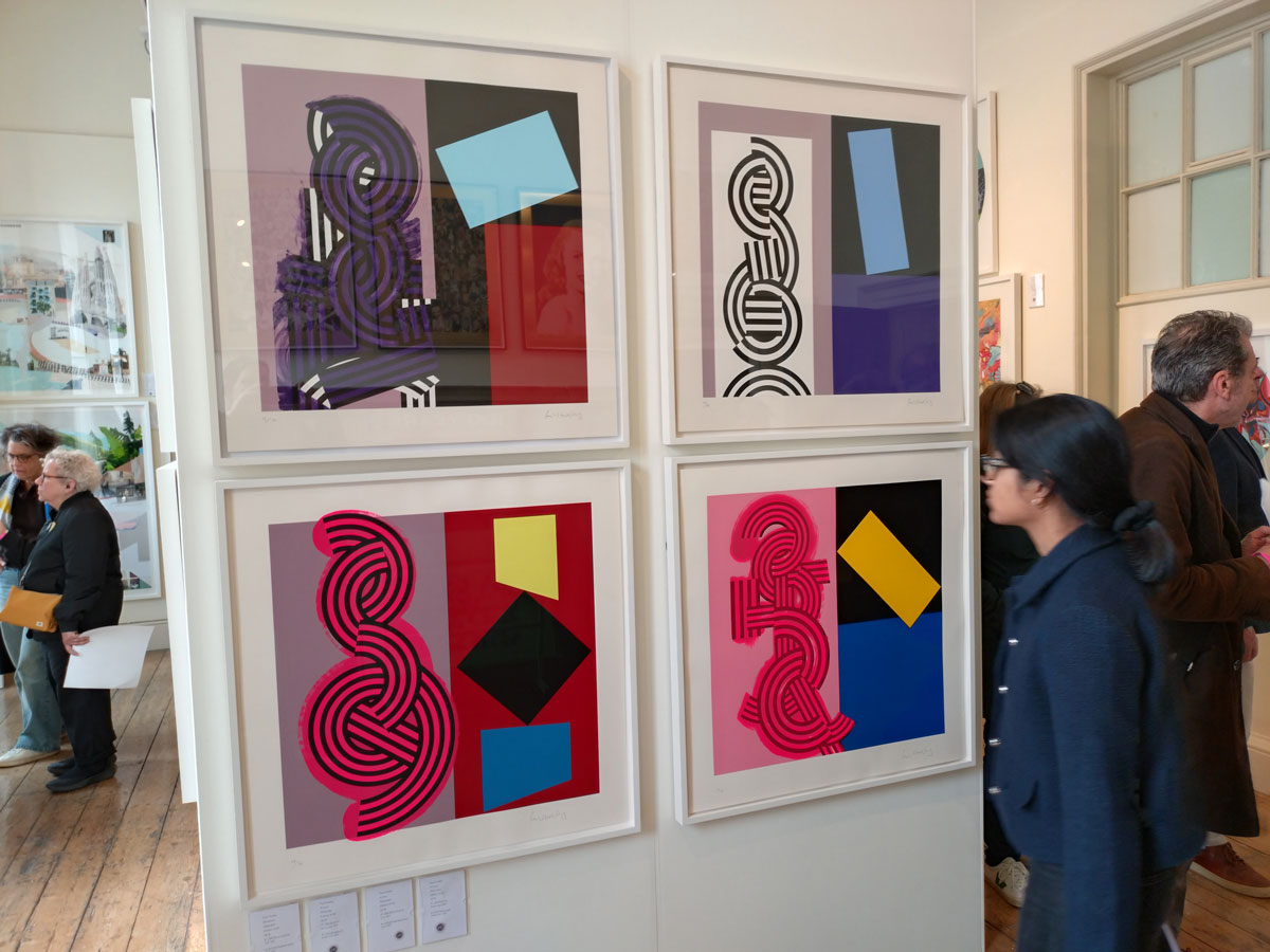
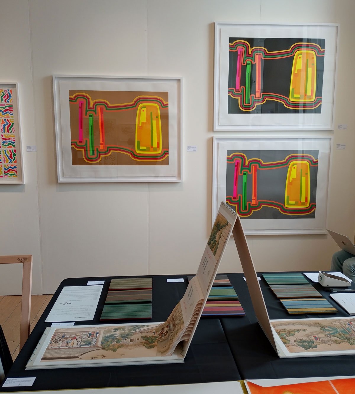
5 and a bit: This list is in no particular order and the Paul Huxley print is a bold piece of fun, Animus, a 2018 edition, a silkscreen print, one of a block of four prints that are hanging together on a wall. Born in London in 1938, one of the artists selected 1964 by Bryan Robertson for that now legendary ‘The New Generation’ show at the Whitechapel Art Gallery and well you don’t need a history lesson from us and it probably is a little throwaway to just call the print a bold piece of fun but it is that and so much more, the kind of thing that got me excited about art and the possibilities of art back there…
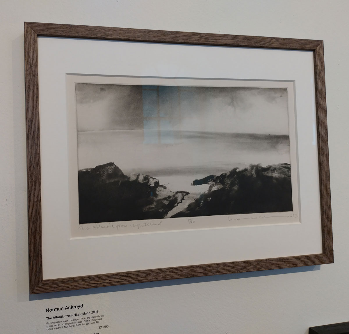
And of course we can’t ignore a Norman Ackroyd print, I do miss going to Norman’s shows and seeing his latest work, there is just one small piece on the Eames Gallery wall at the fair, it is a pleasure to see it though, we lost Norman Ackroyd in 2024, his work was and still is rather special. Here’s more about the printmaker – Norman Ackroyd’s Notes on Water at Bermondsey’s Eames Fine Art. Sadly we lost Norman this week, he was one of our finest landscape artists and although not intended to be, this is a very fitting celebration of the man and his beautifully powerful work, do go and see it if you can…
The London Original Art Fair has now been and gone, it was only a long weekend kind of thing in the middle of May 2026…
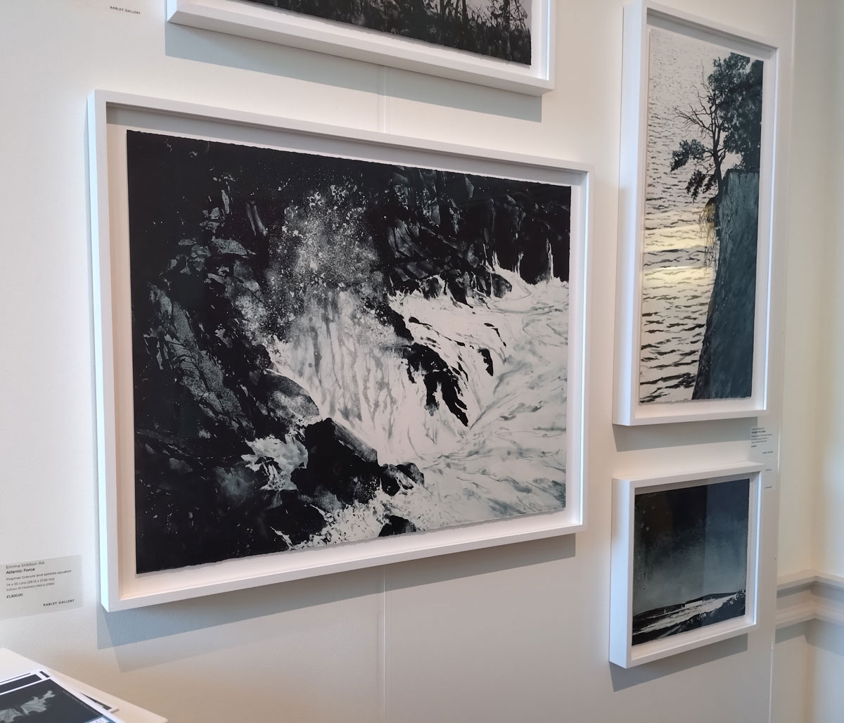
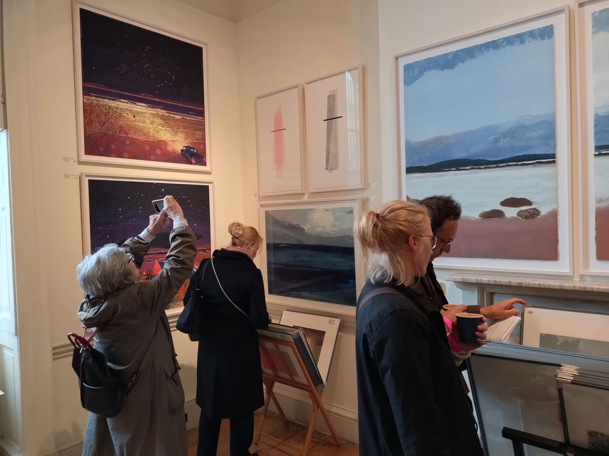
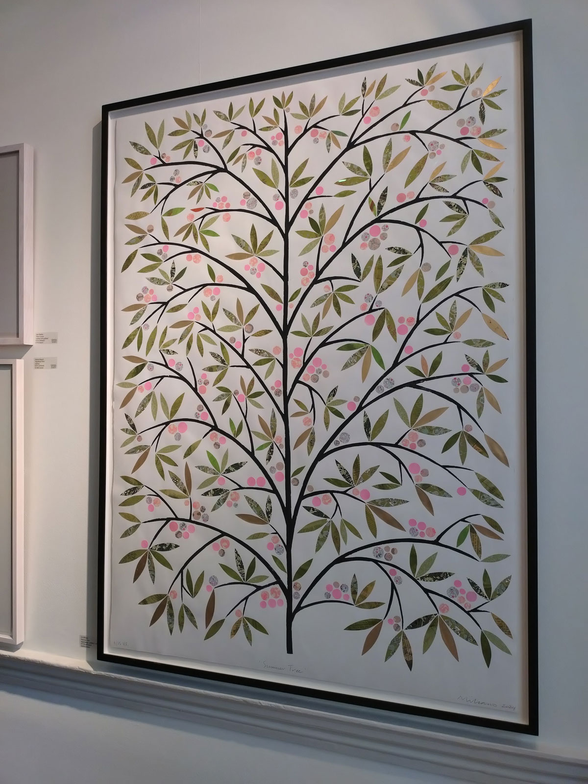
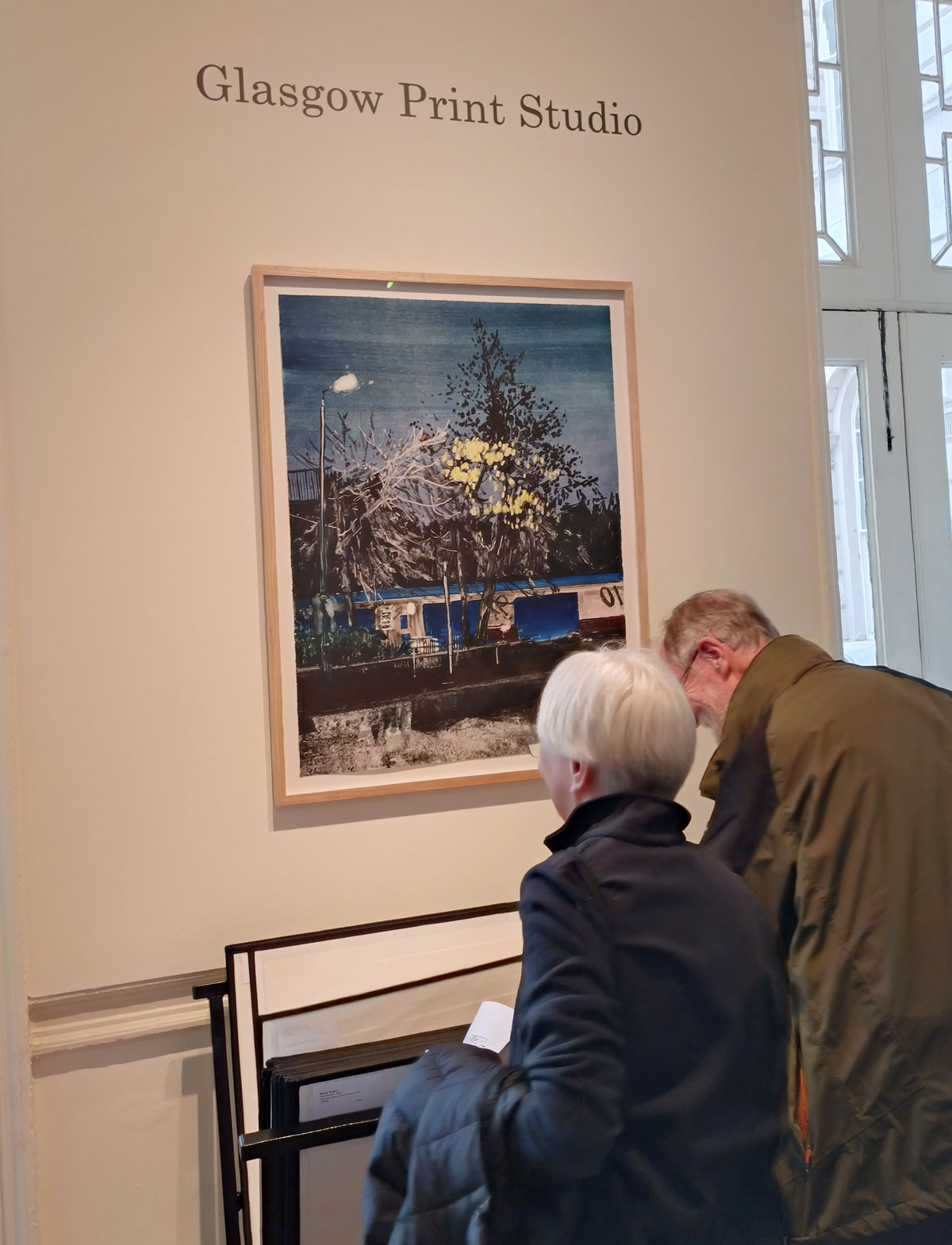
Here’s a bit more of the flavour, do as always click on an image to see the whole thing or to run the slide show…

One response to “ORGAN THING: Cherry picking the best of the London Original Print Fair with Henrik Knudsen, Bruce McLean, Kelly Reemtsen, Colin Gale, Diane Victor, Paul Huxley and the delight of a Norman Ackroyd print…”
[…] ORGAN THING: Cherry picking the best of the London Original Print Fair with Henrik Knudsen, Bruce Mc… […]